| >> |
No. 35781
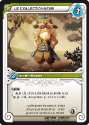
File 129856618918.png - (291.22KB , 365x510 , Le Collectionneur_demo.png )
>>35774
Well everything that is text will have consistent alignment, size, font, etc., yes. We also have the benefit of a high-res image and are able to keep the background of the Traits line (there's the level-up arrow that's missing for the Heroes, but it's always 6/18 XP anyway and could be pasted on easily).
And if I'm doing it myself directly we can cut one step from the process since I translate, (edit) and proofread at once. Instead of translating and proofreading, editing, checking and perhaps editing, checking again - as we have now.
Here's what I can produce even with my extremely limited image-editing abilities and GIMP (compare with OP). The main flaws I see are text readability (not an issue in full size, a bit of a strain when scaled down) and a certain loss in image resolution since I'm ripping the illustration from a smaller picture. The description's font is different, but we hadn't identified it anyway. A possible issue is the available space for the text, but we can reduce the font size of the description to gain some.
If you're in, I'm going to finish editing the rules, perhaps make a few more demos and launch a thread around the middle of the afternoon (EST) or towards the end of it.
|