| >> |
No. 43341
File 137500584184.jpg - (376.44KB , 1440x900 , russell_dug_carl_fredricksen_in_pixars_up-wide.jpg )
>>43338
some things i remember seeing:
http://animationtidbits.tumblr.com/post/25610725625/dota-2-character-art-guide-full-pdf-here
http://www.computerarts.co.uk/features/20-character-design-tips
A lot of it is subjective. That guy might just hate your style more than the designs themselves so nothing you do would make him think otherwise. Or he might be right, but I think that's something you should really talk to him about. It's good to know specifics about what critics dislike rather than just accepting that haters are gonna hate so that you can work on getting better at those weak points, even if you think the actual advice they give you is junk. "Boring" is a pretty harsh thing to say re: art I think, like, even if they violently hated it it means they had a reaction, but if they're just bored they're not feeling anything towards it at all and that's bad.
You might be picking a fairly narrow range of facial features and body types for your characters that they all kind of blend together after a while. You might be giving them the same kind of silhouette and body language and expressions. You might be giving them the same type of nondescript clothing that doesn't say much about who they are as a person, only that they are Average McEverydude; fashion is an important but often overlooked part of character design, which isn't to say all characters ought to be fashionable, just that people wear clothes to send a message about who they are to the rest of the world even if their tastes are bad, out of date or overly, horribly generic. Or you might just have a bad habit of doing low contrast values or uninteresting lines/blocks of colour that don't lead the eye to focal points. Straight vertical and horizontal lines are usually bad--if you are doing something like a pinstripe suit it is usually recommended that you curve the lines with the cut of the pants/jacket even though they are technically straight lines. On that note, you might not be using patterns and textures to their fullest, which can really make or break a character design, so know your fabrics.
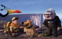
Of course I don't know what your work looks like (you could post some examples I guess, but idk maybe you should make a thread if you are going to do that) but those are some common errors that tend to make for boring designs. I don't really know what you mean by "normal" and "relatable" though and you seem to think of them as the same sort of thing, so like, I think that might be the issue here, your definition of what's normal and all the stuff that falls short despite being normal in real life. These characters in UP for instance, they're very stylised designs, but they're highly relatable because you've seen real people who look like this in every day life, and that in itself makes them interesting. (They would also continue to be just as interesting if they were drawn realistically.) At the same time fictional characters who look like them are anything but common because, for whatever reason, they aren't coded as "normal." You are missing out on a big chunk of neat designs if you stick to what you consider to be normal.
P.S. the other thing is that makes these good character designs is their clothing, they're a good example of why fashion is important. You know exactly what kind of a kid Russel is by the things he carries with him and how he wears his uniform. None of the characters' costumes in the movie are out of the ordinary, but they still seem unique and interesting because of the detail work and personalization.
hope this helps
|